Today we're going to discuss something I've been studying for the past two years - UI design! Specifically, we're going to be discussing HUD elements. I'll save discussion of diegetic UI for another time. While I'm far from an expert, I do feel like I'm competent enough to share what I have learned to others looking to get into UI design for their games.
I'll share an example from a project of mine that is ostensibly done, but not released yet: Arcanus: Continuum. It's a modification for Minecraft: Java Edition that creates a whole new system for creating and casting magical spells, and it's one I'm quite proud of! Like all my projects, it was a chance I took to learn new things, including delving more into UI design - studying other games, iterating on my own ideas and getting feedback, and reading up on material others have written on the subject.
Let's take a look at what the player will be spending 90% of their time looking at when using this mod - the HUD!
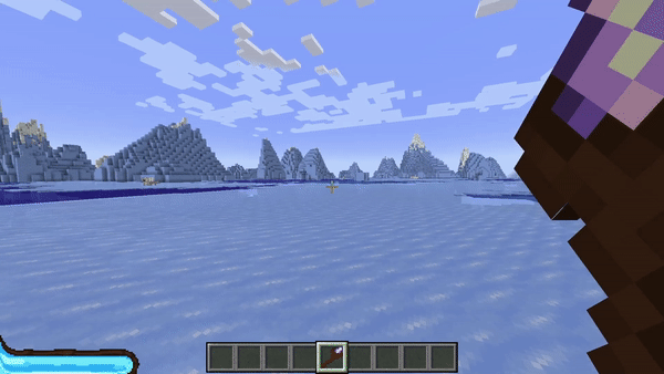
Let's start at the bottom left and work our way over and up. In the bottom left corner, we can see a blue and brown element. This is the player's mana bar - mana being a regenerating resource that spells require in order to be cast. This is a transient HUD element.
In the bottom middle of the screen is the player's hotbar - a quick-access section of the player's inventory. There's a small box that can slide along the hotbar to show the item the player has selected. This is from base Minecraft, but I would be remiss to not mention it. This is a persistent HUD element.
Above that, we have text that reads "Empty". This is the name of the spell being cast - in this case, we aren't casting anything so it just says Empty. On the backend, we are technically casting a spell, but it's a completely empty spell, hence the name. This is also a transient HUD element.
In the very center of the screen, we have the crosshair and some spinning circles. The crosshair just lets the player know where the center of their screen is - usually used for attacking enemies or mining materials. The crosshair is also a persistent HUD element.
The spinning circles, however, are special. These are used to determine the spell being cast based on the combination of inputs. Spells are tied to different combinations consisting of left and right clicks, chained together to a maximum of 3 inputs. These are also used to telegraph the spell the player is casting to other players, allowing them to adapt in a fight. This is another transient HUD element.
Last, but certainly not least, we have the staff the player is holding, which is also a transient HUD element. This just helps make it more apparent what the player is holding at a glance. As we can see, the staff being held takes up a rather large portion of the screen. This serves two purposes:
- It helps give a sense of scale to how big this staff actually is. If we were to look at the player from another perspective, we would see that the staff is nearly the same height as them!
- It also serves as a drawback to carrying the staff around at all times. Because this tool is so powerful - allowing players to cast spells - it requires some drawbacks. In this case, reducing visibility.
Now, you may be wondering what I'm referring to when I say transient and persistent HUD elements. Transient HUD elements are elements that can be gotten rid of by way of player input during normal gameplay. An example of this would be the mana bar, which will disappear when the player holds something other than a staff. A persistent HUD element is the opposite - a HUD element that remains on the player's screen throughout normal gameplay, regardless of inputs.
Why is this distinction important? Because persistent HUD elements are a lot easier to mess up than transient HUD elements. Both can negatively impact players, but transient HUD elements are usually a lot easier for players to forgive if done poorly - the staff item being an example of a transient HUD element being done poorly.
Let's take a look at a still image to see what I mean:
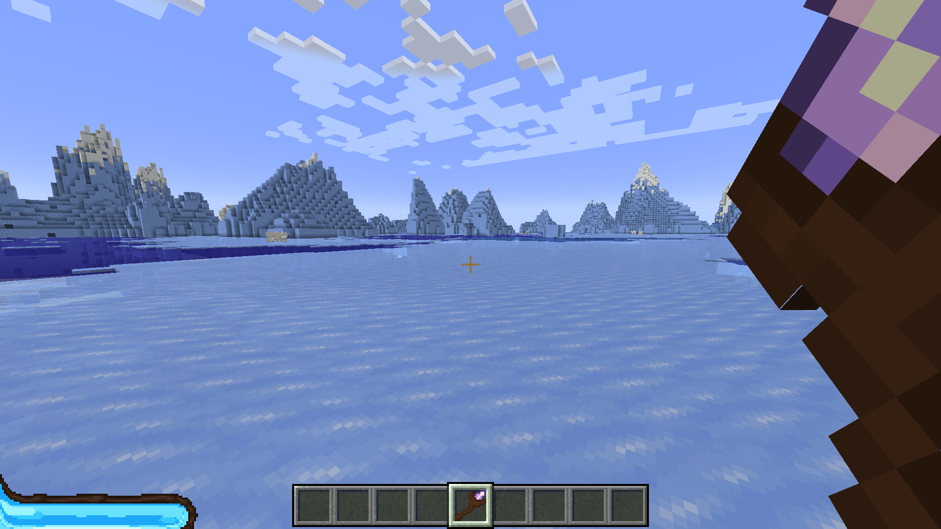
Here we can see that the staff, when just being held and is doing nothing for the player, takes up nearly 20% of the screen! Yes, it was done with intent and serves a slight balancing purpose, but that doesn't make it good! All this accomplishes is annoying players, and disincentivizes them from using the staff at all beyond the initial novelty of it.
If I were to redo this, I would probably put the staff a little further away from the camera, allowing it to retain the perceived size, without reducing visibility as much. In the grand scheme of things, it wasn't all that important, but it was a decision made early on that I didn't revisit as I had a lack of testers to give me feedback.
After the fact, I created a screen region map for HUD elements. It's not meant to be taken holistically, but it is a useful starting guide to reference:
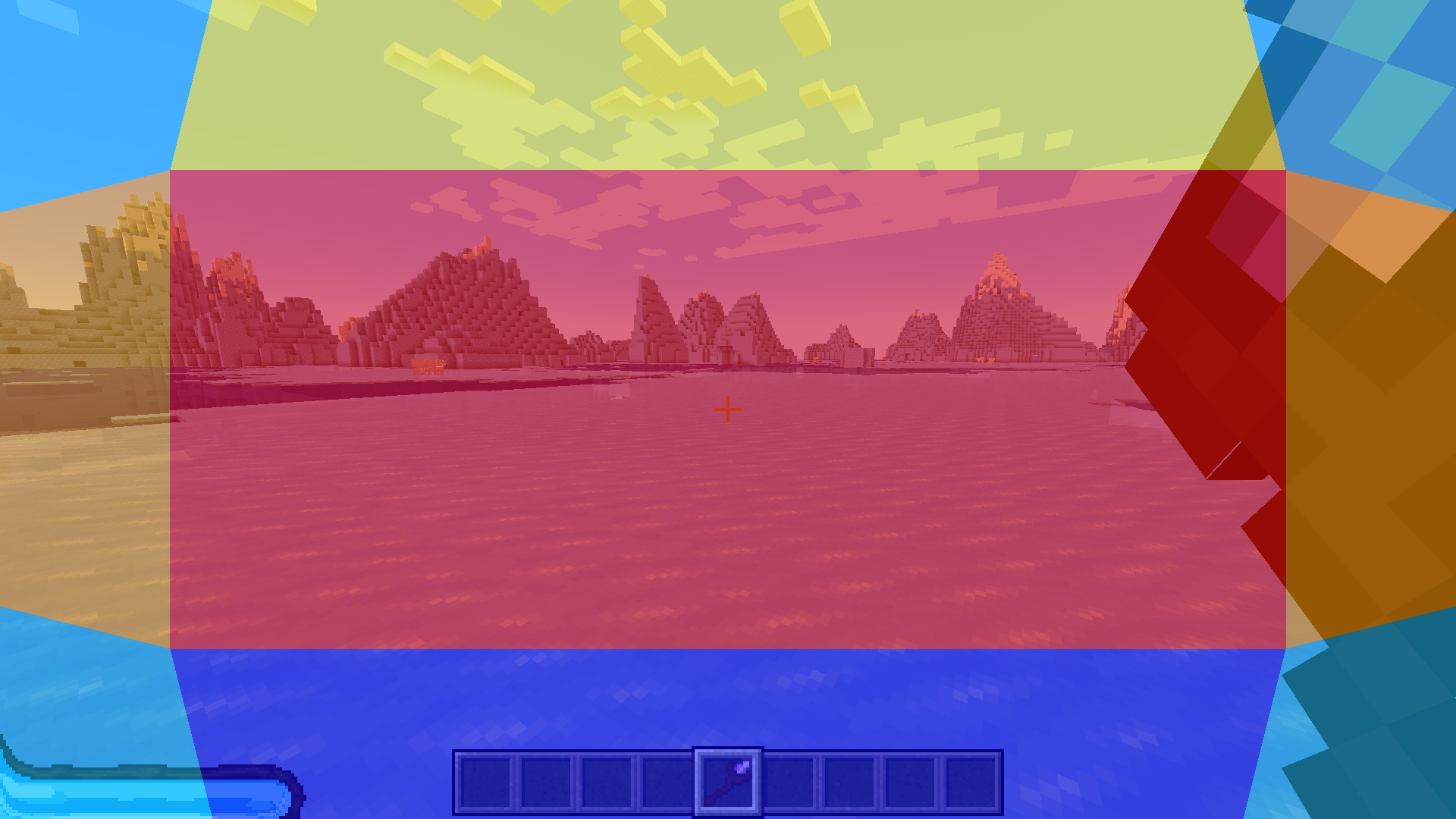
Here we can see the screen divided up into 8 regions: the corners, the sides, the top and bottom, and the center. I've weighted them with different colors to help give a rough idea of the sizes of each of these regions relative to a typical 16:9 display.
- Dark Blue Region - this region at the bottom is where you can safely put just about any persistent HUD elements. The player's eyes are usually glued much higher up, but it keeps them very close in the periphery, allowing players to make quick judgements easily.
- Light Blue Regions - these corner regions are the next best places for persistent HUD elements. They're very out of the way, and a popular choice for many games to put resource bars, such as health, magic, or ammo (Skyrim, Overwatch, and Team Fortress 2 to name a few examples).
- Yellow Region - this top region is where I would only put transient HUD elements. While persistent HUD elements can work here, games with a lot of verticality usually benefit from this space being clear most of the time. Enemy health bars are a common transient element to put up here, as it gives plenty of space due to it not being suitable for persistent elements.
- Orange Regions - these side regions are areas I would avoid putting large elements if at all possible. In many first person games, at least one side will usually be taken up by whatever item the player is carrying, but they're usually kept small so as to not completely take up the periphery. This is why my staff's positioning is as bad as it is. It cuts off all your right side peripherial vision, leaving you blind to anything that may be there.
- Red Region - it's best to keep this center region clear of anything but very transient elements - such as the circles to show the player's inputs - and the smallest and highly important persistent elements - such as the crosshair. This is where your player is looking the most. It's okay for elements to occasionally bleed into here, but only if there's plenty of peripheral vision.
With that in mind, let's look at when the player is actually casting a spell!
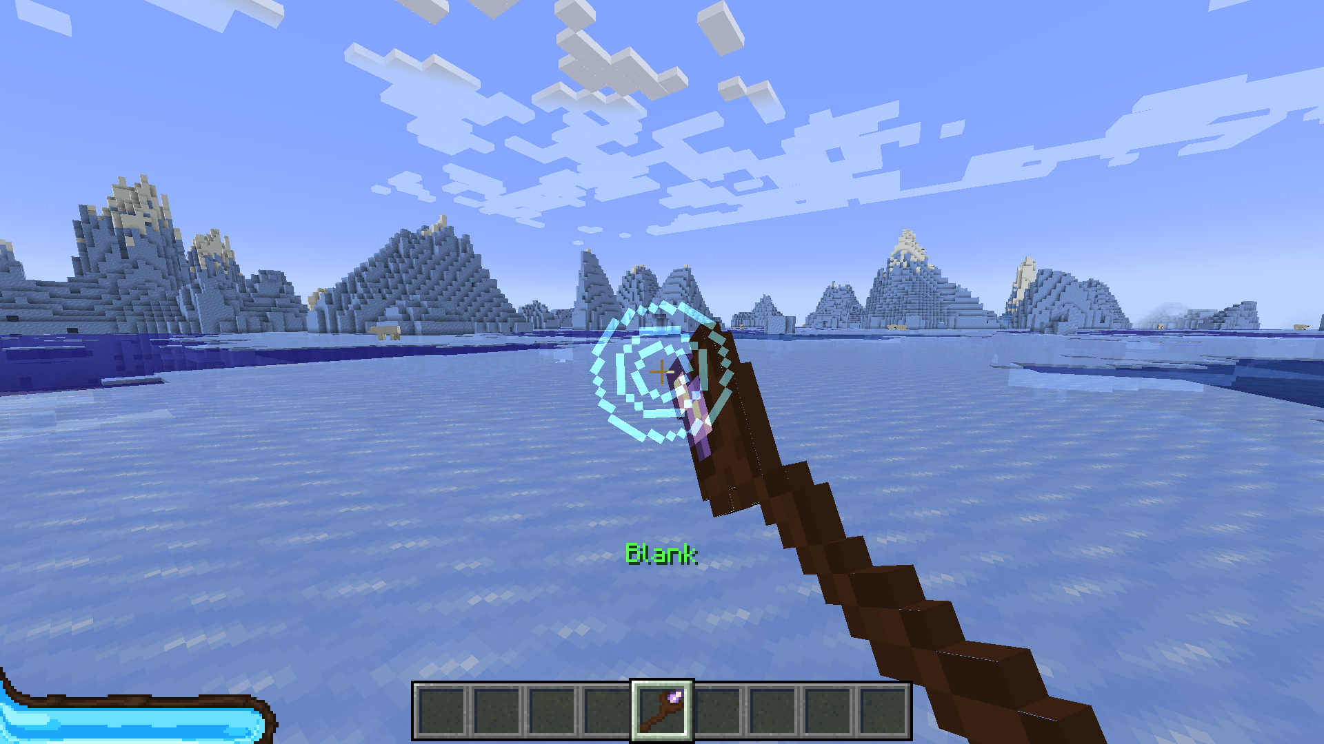
All of a sudden, the player has a lot more visibility! Because the staff points towards the middle of the screen, it starts taking up much less of the player's vision DESPITE being in that red zone. This is one of those situational moments where elements bleeding into the middle works - because the peripherial is completely wide open!
As for the indicator circles, despite being fairly large, they are also partially transparent, allowing for better visibility than they otherwise would. While I could have put them near the hotbar, to make them even more out of the way, because they're so important to the player's ability to tell at a glance that the game did register their input properly, I put them right where the player can see them easiest.
This also parallels how they appear to other players, surrounding the staff as it's held out in front of the player. Again, these are used to telegraph spells for other players. This parallel helps with making it more apparent what the circles they see on other players are if they have interacted with the magic system and seen the indicator circles in first person.
While not shown in these images, they take the shape of either a circle or a square, which was done explicitly for accessibility reasons. I'll get into accessibility in game design in a future post, as this one's getting quite long as it is.
So, let's take a look at this image with the map overlayed:
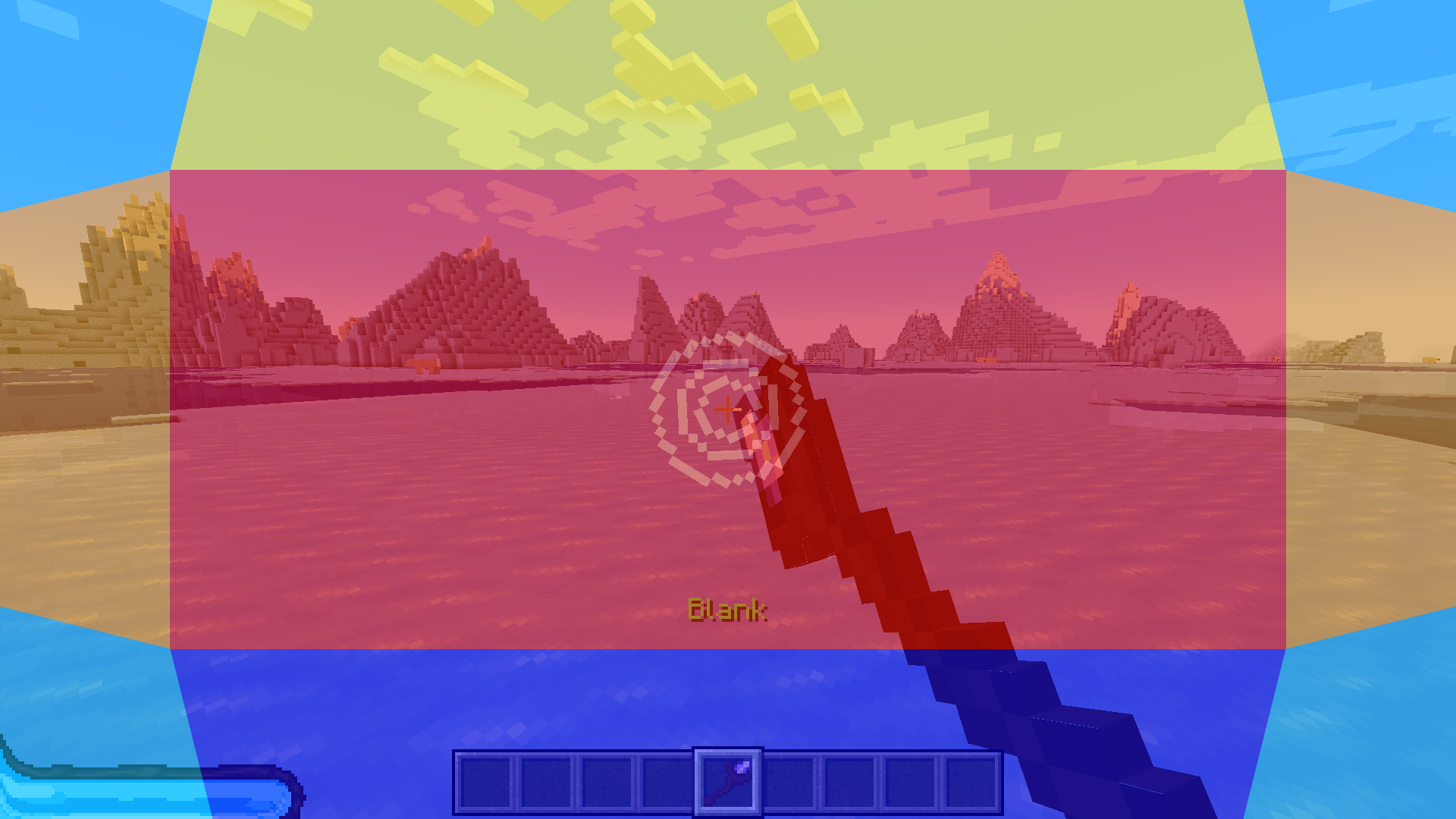
As we can see, very little of the critical areas of the screen is taken up now, giving very good visibility for the player casting spells. The HUD elements that bleed into the critical areas are kept small and in constant motion as can be seen in the gif at the top, while the persistent elements remain in the non-critical zones.
While this post has mainly focused on first-person games, the general principles discussed apply to nearly every genre. From what I've seen, much of this has just become accepted as industry standard - such as having most persistent elements near the bottom of the screen - but very few designers have offered an explanation as to why!
I also hope this goes to show that, despite being able to recognize mistakes you've made in a given project, it's still okay to be proud of them! At the end of the day, you learned from that project, and can either revisit it later or take what you learned to make your next project even better! That's always something to be proud of!
With that, I hope you found this episode of Design Dialogues informative, and I hope you all have a wonderful week!